If HTML provides the semantic content of a site, CSS works to provide emphasis on visual
hierarchy and aesthetic elements. While not necessarily informational content, using CSS well
should enhance your ability to make a visual argument in the form of a web site. In addition,
CSS can make or break the accessibility of a site.
This brief snippet controls all <body> content. Adding or changing properties
in this block would affect anything contained therein. This constitues a rule,
encapsulated by { }. Each property rule terminates with a ;.
Examples:
A property: font-family
A value: system-ui
CSS can contain comments, pre- and post-fixed by /* */
The above example only features a few properties. You could see the whole list,
but know that, like HTML, their context and relevant combinations varies widely by the individual property; not all of them
use the same syntax, though there are several patterns to pick up.
Some of the main syntax patterns:
font-size: 12pt;
margin: 0 auto;
border: 1px solid #D9D9D9;
display: block;
color: #FFFFFF
margin: 0 1rem 2rem 3rem;
--printers-black: #222;
...
You will memorize the ones you use the most, and look up those that you don’t. While there may be some developers
who can recite the majority from memory, it’s highly unlikely that anyone does; mostly, completion and other
automatic tools fill in.
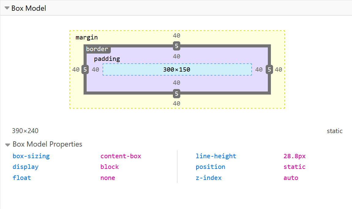
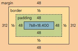
The standard model allocates the majority of size to the content. This is the default assumption. Developers
can specify this by using the box-sizing: content-box property, but (as written) this setting is the
default implied by the browser.
The alternate model includes the padding, margin, and border in its sizing calculation, giving
the remainder to the content. This is triggered by giving an element the box-sizing: border-box; property.
Notice how the content here appears smaller due to the deprioritization of content space allocation. This
approach is used more often in modern web design, as it prioritizes the elements rather than the content.
Doing so permits layouts to line up more easily.
In our above example, however, notice that the implementation of these properties do not need . or # in HTML:
they are attached to elemnents via the class and idattributes.
Designers enjoy a greater range of ability when laying out pages that the original HTML/CSS specifications provided.
Typically, the modern web is laid out using some combination of grid elements and flexbox layouts.
Using the display: grid; property allows designers to create aligned designs in two dimensions (x and y). Much
like a table in Excel or Google Sheets, there are creative ways to merge cells to allow content to take up more
than one column or more that one row. Here, we introduce a new unit as well, the fr:
.grid__2_col {
/* Display this block element as a grid */
display: grid;
/* Make it 50 x 1 unit of viewport width */
width: 50vw;
/* Make each column 1 fractional unit (fr), and repeat twice (2) */
The div is the first real unsemantic element that we’ve encountered: it’s a general use, multipurpose player.
Generally speaking, the div is meant to provide two purposes:
create groups of semantically- or arbitrarily-related content
develop areas of pages to style
As we will see in future weeks (and you might have already seen in other pages), the div is an accessibility
issue, but is one of the (if not the) most used elements on the web. We’ll square this when we talk about
ways to make them more accessible through metadata.
Anything can be “grouped” in a div, and we can apply class and/or id properties to them. It becomes
necessary to use them, but if we do so in an intentional way, we can make our layouts rely on these generic
items less.
Since 2022, the CSS specification supports CSS variables.
These expressions are powerful tools in making sure that properties which need to be repeated use
the same values all the time.
In practice, this uses the :root psuedo-element:
:root {
--webco-color-purple-bg: #432194;
--webco-color-gray: #D9D9D9;
--webco-printer-black: #222;
--webco-white: #fff;
}
Using these variables often looks like this:
header {
background: var(--webco-color-gray); /* Notice the var({VARIABLE}) syntax*/
height: 3rem;
align-items: center;
display: grid;
grid-template-columns: repeat(3, 1fr);
padding: 03rem;
}
This can be used for more than just colors, though. Take, for instance, standardizing a type face:
:root
{
--webco-primary-type: "Inter", sans-serif;
}
Putting this into practice:
html {
font-family: var(--webco-primary-type);
}
Using variables for common values goes far toward maintaining unity and the overall polish of your
site’s aesthetic.